Brand guidelines · v1.0
One mark. Every surface.
Logo, colour, type and voice for Bitrora. Use these files and rules everywhere: web, decks, social, print.
The logo.
The aurora mark with the wordmark. Use the primary version on dark backgrounds wherever you can. That’s home.








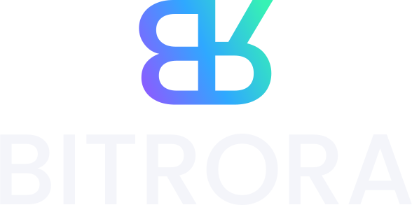


B meets R.
A B turned 180° and an R flipped on its back share one stem: Bit + Rora. The R’s leg becomes a rising arm, pointing up and to the right.
The larger bowl sits on top. Built from Poppins Medium, so it shares DNA with the wordmark.
Its leg becomes the arm: growth, momentum, up and to the right.
Stroke weight is 16.4% of cap height, identical to the wordmark, so mark and type sit as one family.
Give it room.
Keep clear space of x on every side, where x is half the cap height. Nothing else enters that zone.
96 px wide on screen · 25 mm in print.
16 px on screen · 5 mm in print. Below that, use the app icon.
Please don’t.
The logo is only ever used from the supplied files. Never redraw, retype or edit it.
Dark sky.
Aurora light.
Bitrora is mostly night. The aurora is a light source, not a paint bucket: use it for the mark, highlights and moments that matter. Click any swatch to copy it.
Aurora · accents
linear-gradient(100deg, #8B5CFF, #2FA8FF 50%, #36F2B4)Core · night
Aurora deep · for light backgrounds only
Proportion
For developers
:root {
  --bg: #05050A;     --bg-1: #0A0A11;   --bg-2: #101019;
  --text: #F4F5FA;   --text-2: #A6A8BA; --text-3: #7B7D93;
  --violet: #8B5CFF; --blue: #2FA8FF;   --mint: #36F2B4;
  --grad: linear-gradient(100deg, var(--violet), var(--blue) 50%, var(--mint));
  --font: "Geist", system-ui, sans-serif;
  --mono: "Geist Mono", ui-monospace, monospace;
}
Geist, tight
and confident.
Geist for everything you read. Geist Mono for labels, data and small caps. Both are free on Google Fonts. The wordmark is custom artwork: never retype it.
ABCDEFGHIJKLMNOPQRSTUVWXYZ
abcdefghijklmnopqrstuvwxyz
0123456789 $%&@→
ABCDEFGHIJKLMNOPQRSTUVWXYZ
abcdefghijklmnopqrstuvwxyz
0123456789 {}[]()</>
Medium · 56–118 · −5.8% · 0.9Medium · 38–76 · −4.8% · 0.96Medium · 22–27 · −3%Regular · 17–20 · −1% · 1.55Regular · 16 · 1.6Mono Medium · 12 · +14% · CAPSThe toolkit.
A handful of pieces, used consistently. Hover them, they’re live.
One light pill per view. It’s the action we want.
Section label
Hairline border, cursor spotlight and an aurora edge on hover.
Live WebGL light. Hero and closing moments only.
4% film grain over every page keeps black from feeling flat.
A 72 px hairline grid, faded with a radial mask. Structure without noise.
Less words.
More proof.
We sound like founders talking to founders. Every sentence earns its place or gets cut.
If it reads fine without a word, remove the word.
Numbers over adjectives: “15M+ staked”, not “huge success”.
No hedging, no jargon. Say what we do and when.
Write like a person, not a press release. Contractions welcome.
Say
Idea to MVP in 6 weeks.
A founder replies within 24 hours.
Architect. Build. Scale.
Don’t say
We leverage cutting-edge synergies to accelerate your digital transformation journey.
Our team of experts will be in touch at their earliest convenience.
BitRora · BITRORA in running text
Every file.
Vector SVG is the master. PNGs have transparent backgrounds unless noted.
Bitrora brand kit
Logos, icons, social images and this guide’s colours in one .zip.